The blind marketing to the blind!
So I get home from work yesterday, kick off my cowboy boots and find a letter on my doormat. I pick it up and walk to the bin! ‘more junk mail’
Most cool cats would have dropped it in the bin, made themselves cup of dandelion and burdock and sat down to tuck into some monster munch! But being in web marketing… on the way to the bin I take a second to ask myself why is this letters fate already sealed before I’ve even opened it? And what did its creators do wrong?
It’s a simple thing and daft thing I know.. to the everyday person just getting some junk mail and throwing it is hardly worthy of a blog post! But from the point of view of the publisher that letter being opened was of the utmost importance!
Think about it.
They have had hired a marketing team to design and work on it, planned its copy articulately, lined and measures the text so what they think is ‘key information’ is showing through the expensive printed high quality gloss double windowed envelope! Not only this but also paid for the distribution and data capture of addresses to send it out in the first place! In summary they have spent a lot of effort making sure this letter gets read.
Clearly a LOT of planning, time and money has gone into getting this message across, yet as I drop it into the bin.. they have failed. Obvious to us, but to them.. why would it fail? after all that effort?
So lets look at the letter from my point of view looking up at me from the doormat.

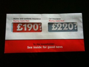
Within a fraction of a second my eyes have taken in the content and processed it to my brain with result ‘ok.. red and blue bright colours, two large money figures, it doesn’t have MY name on it anywhere nor even in fact what company its from, bold red line across the bottom with ‘see inside for good news’ – yes well that’s descriptive? im thinking spam, readers digest, useless tat’ Result = in the bin it goes.
The simple reason and most important of all.. it looks like spam! It looks like every other failed marketeers attempt of making a flyer or letter that ‘stands out’ and what we have come to expect of it over the years of getting this crap! Just like when browsing the web it has been proven most peoples eyes now automatically avoid advertising banners (unless of course they’ve got boobs on them.. and this isn’t a joke, its fact)
That all took a fraction of a second. = Bin. I asked the Mrs the same question when she got home with what she would of done with it.. same answer. I showed the photo to other people too.. same answer ‘junk mail’
So lets look at it from the designer and publishers point of view. Same letter?

Firstly the boss comes up with a great idea and hires the marketing team who assures him they have done this many times before and got good results. The marketing team sit round and after numerous brain storms and meetings they decide the best thing to do would be to show their ‘great’ prices openly and honestly in bold on the front of the letter! Great! They then plan out its content (of which i didn’t even read) in the same way planning out the best information to get across and the most direct way of doing it. Which I guarantee has been aimed around ensuring it all leads the consumer in the direction of making that final contact, phone call or viewing their website.
Now the exterior.. bright bold colours stand out.. will make people pick it up and get attention, so red and blue is good, how about with high quality envelope glossy with bold red printed line across the bottom.. and we will even pay extra to get the windows where we want on the envelope so you can see the big bold prices through those windows. A now a nice strap line to finish it off.. something that would make you want to open it.. hmmmm what would make me want to open it.. how about ‘See inside for good news’ (lol!) brilliant all done! hey drop it on the bosses desk and he loves it.. great it stands out, bold & colourful and gets the prices across straight away through those expensive, but worth it double windows! They pay for data capture, postage and off it goes.. to millions of peoples bins! Well done!
Resulting in probably about a 10% conversion rate, that WILL cover the cost of the letter and make profit.. but badly done, and not doing a very good job for the company nor the remainder 90% of the population getting sh*t they don’t want.
SO where did they go wrong.. somewhere in between their entire weeks of planning, and my fraction of a second junk mail decision.. there is something important missing.
A single quote from Einstein has the answer “Any intelligent fool can make things bigger, more complex, and more violent. It takes a touch of genius — and a lot of courage — to move in the opposite direction.”
Sitting there in that room they planned what they ‘thought’ people wanted, they planned around what stands out to their eyes, from their position within the company, and what looks bright and bold to them. Without for a second taking a step outside of their body and mind into a 3rd person perspective and imagining that letter on a doormat. They tried to hard..
So you get the point.. they needed to target people better, change the old ‘spam design’, include the company name, and MY name.. plus a hell of a lot of other ‘current’ marketing ploys that are simple, work and effective. But to find out the rest of them you’ll have to hire me (cheap plug lol)
The be all and end all.. don’t come to the same final production of a message that looks like every other piece of spam out there, just because that’s the way its always been done.

